UX Best Practices for Building Membership Sites
You have landing pages, CTAs, contact forms and all of the basic design features just like everyone else. But the difference between a membership site and a normal site is that you also have people returning on a daily or weekly basis for a very specific purpose: community.
Having a community-based site is not just about creating a static work of art. You have to create something interactive that fosters a sense of community and contribution.
Designing for a highly interactive site comes with certain challenges and requires certain solutions, especially if you’re going to make the user experience rich and fulfilling for everyone involved.
Here are a few of the best practices to keep in mind while diving into the design of a community-based membership site…
Consider Your Goals
In the words of Jeff Horvath, “A good user experience, like a measurable ROI, doesn’t typically happen by accident. It is the result of careful planning, analysis, investment and continuous improvement.”
Planning for the unique needs of a community is different than planning for visitors to a blog, or shoppers to an e-commerce site. Online communities are more organic, and the value comes from natural interactions rather than content or product promotion.
A community-based site will essentially have two goals in mind: to promote the community and to make it easy to contribute. Every part of your UX needs to revolve around these two things.
So what does that entail, exactly?
Consider User Behavior
Humans are notoriously unpredictable, and managing member behavior can be difficult. But, thankfully, there are a few things that members tend to do fairly consistently: browse, search and contribute.
Browsing
Keeping members happy is about giving them a certain level of value for their membership. Your users are constantly asking, “Should I stay?” and “How long do I need to be here?”
If you’re looking to provide value for members while giving them a chance to consistently return to your site, browsing is the perfect way to do that. Your design should immediately tell members where to go and what to look at.
Consider including elements such as:
- Content previews with bold headlines
- Thumbnail imagery
- Calls-to-action to help users browse
- Clear access to additional content (categories, directories, archives)
- Content in a variety of forms (forum threads, posts, articles, uploads, images, etc.)

Searching
If your members aren’t browsing for general content, they’ll be searching for specific information. At some point they will expect a functioning, helpful, and relevant search tool that doesn’t put the burden on them to wade through unnecessary or irrelevant content.
Search filters should focus on content types, members, topics, content dates and user ratings to give a variety of search options for optimal user experience.
Contributing
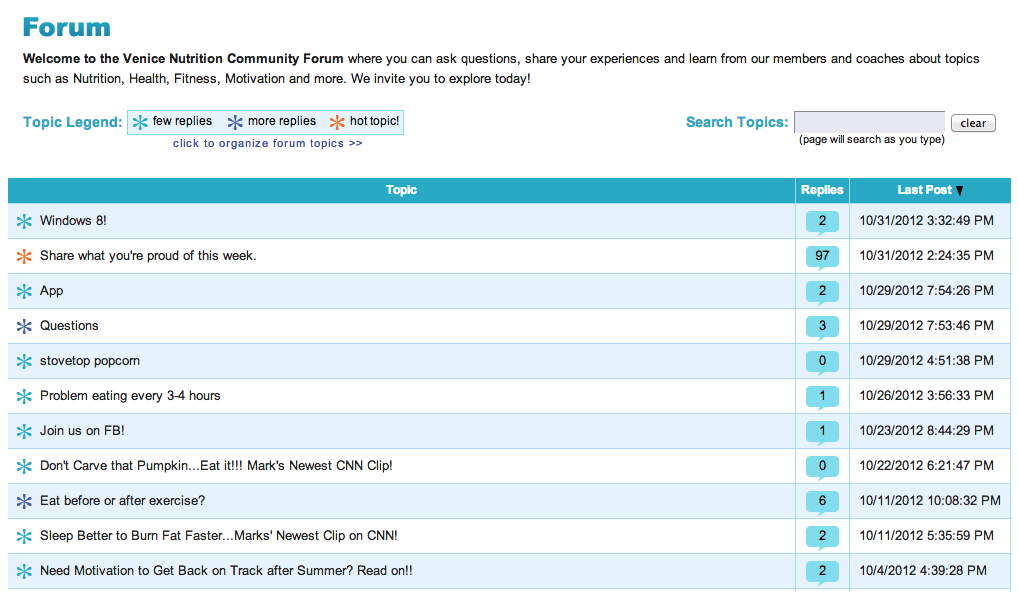
One of the biggest advantages of a membership site is contribution. Unlike blogs where the most interaction you’ll receive is a like, share or comment, community-based sites tend to provide more interactive value.
Good UX options for member contribution include:
- Community forums
- Content and forms that allows tagging other members
- Sharing options for member photos and videos
- Uploading member-generated content

The key to success for any of these methods, is that member engagement must be effortless. UX designers should include strong CTAs, prominent buttons and simple forms to allow users to input, review and publish quickly and easily.
Consider Sign-In UX
Another major difference between the UX for a regular site and a membership site is login.
Your membership site will essentially have two fronts: your homepage before sign-in and your homepage after sign-in.
Your after sign-in page contains different content and features – usually access to a member dashboard or other interactive options not available to visitors – but the branding and general feel of the post sign-in page should be the same.
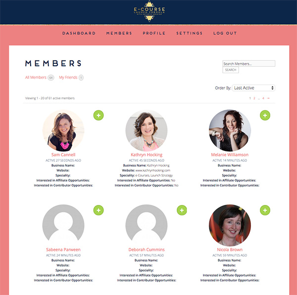
For example, Kathryn Hocking’s E-Course Launch Formula program does a great job of sticking to branding, style guides, and theme throughout her whole site, including her pre-sign-in content, her sales page, emails and even into her members area (post-sign-in pages).

Here are some things to include in your pre-sign-in pages:
- Strong CTAs that invite users to join
- Value propositions for non-members
- CTAs and visual cues showing members where to login
Some things to include in your post-sign-in pages could include:
- A community activity feed
- Personalized links
- Latest content
- CTAs to register for events, download content, etc.
- Notifications of events or community news

While each page includes different elements and has a different purpose, it’s best to use the same branding and style guide for both to create a sense of unity among users.
Consider Member Profiles
Another more complicated aspect of member sites is the member profiles themselves. UX designers should think of these profiles like a member’s online identity – they are snapshots that give each member a sense of belonging, so what you allow them to include (or not include) in their profile matters.
A good profile page should include elements of an online persona – an “about me” section, link to a personal website, contact information, photos, etc. – as well as featuring examples of how they’ve contributed to the community.

When considering profile design, consider the following:
- Personal and professional affiliations
- Privacy concerns
- Photos and avatars
- Badges and awards for community engagement
- Membership level listing (if applicable)
- Edit buttons for updating your own profile
- View-only state for seeing another member’s profile
- “Renew membership” CTAs
- Links to newsletters or featured content
- Forum topics or categories
- Event and news notifications
The main goal of a good member profile is to showcase his or her personality for other members, to improve overall engagement and to provide updates and important information for the member, too.
Final Thoughts
Designing for a community site is ultimately more about UX than it is about making things pretty, but both things go hand-in-hand.
It’s important to have a strong design but to focus on elements that are unique to communities like having browser-friendly content, powerful search engines and areas for members to contribute.
It’s also best practice to focus on creating a good UX for non-members before they sign in, as well as for members after sign-in, with a highly functional member dashboard and profile that showcases personas and allows for further engagement.
If the UX is done right, the community will grow and be of increasing value to members and non-members alike.
Joanne
Joanne is a writer who specializes in educating online site owners about building a thriving membership business.
 Blog
Blog Podcast
 Support
 Customer Login


