Why Your CTA Location Matters If You Want Conversions
Your call to action (CTA) is an incredibly important part of your site. It tells visitors how to subscribe to your blog, start a free trial, schedule an appointment, book a consultation or download that nifty e-book you spent months putting together.
Your CTA is your secret weapon to generating leads and nabbing conversions, but a bad CTA will do neither of those things.
That’s why we’re taking a look at what makes a CTA effective and, more importantly, how a CTAs location can have a big impact on your overall conversion rates.
How CTAs Affect Conversion Rates
CTAs are marketing tools designed to tell visitors how to interact with your business. They let them know what paths to take through your website, how to accomplish a goal or how to access resources that will help them on their journey.

But how important are they in terms of conversion rates? Very. Here are a few stats from Protocol 80:
- Emails with a single call-to-action increased clicks 371% and sales 1617%. (WordStream)
- Adding CTAs to your Facebook page can increase click-through rate by 285%. (AdRoll)
- HubSpot found that anchor text CTAs increased conversion rates by 121%.
- Personalized CTAs convert 42% more visitors into leads than untargeted CTAs. (HubSpot)
Basically, if you want to improve business, you should be including CTAs in your marketing strategy. More specifically, on your website, social media, emails, newsletters and anywhere else you can think.
In fact, more than 90% of visitors to your website alone will read your CTAs and, ideally, you want all 90% to click on them, too.
So what are some important factors to keep in mind when it comes to making sure your CTAs are noticed (and clicked)?
Above the Fold Vs. Below the Fold
When it comes to CTAs, it’s all about location, location, location.
Generally speaking, there are two main locations to consider when placing your CTAs: above the fold and below the fold.
“The fold” is the portion of your site that is visible to users without having to scroll. It dates back to the days of newspapers when people included all the important information above the physical fold. (If you want to find out where the fold is on your site, you can go here: Where Is The Fold?).
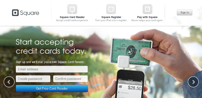
So how does the fold effect CTA conversion rates, and where exactly should you place your CTA: Above or below the fold? Here’s what you need to know:
Above-the-fold CTAs are great for customers who already know what you do. If your business is fairly successful or well known, then having a CTA above the fold can work wonders for capturing leads.
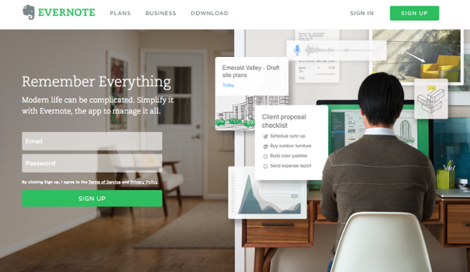
Sites like Evernote and Dropbox, for example, make their CTAs the main focus of on first look. But then again, they are both top apps in their respective field, and users generally know what they are getting themselves into on their first visit.
If your business is generally less well known or niche, you might want to keep in mind that…
Below-the-fold CTAs are great for businesses that need a little more explanation before customers take action. Even if you have explanatory information at the top of your page, you can still put a CTA at the top. However, studies show that everyone scrolls, so you may want to place your CTA at the bottom, as that’s where visitors are headed anyway.
But can you have a CTA at the top and the bottom of the page? Of course you can! In fact, multiple CTAs can have a huge impact on conversions.
Single CTA Vs. Multiple CTAs
Aaron Bolshaw over at Act-On started A/B testing single CTAs versus multiple CTAs and found that using multiple CTAs “routinely lifted engagement by 20%.” Though he also noted that there are important times to use single CTAs, too.
On the whole, studies show that multiple CTAs often work better for improving conversion rates, so while you’re busy debating whether or not you should include your CTA above or below the fold, you could probably do both without much consequence.
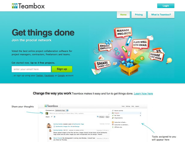
But in what cases might a single CTA work better?
Single CTAs often work the best for short landing pages, emails, surveys and any sort of promotional content with a single actionable item. FulcrumTech wrote an article showing how a single CTA attached to their newsletter netted them a response rate 27 times higher than normal.
The key to an effective single CTA is having a clear statement of action, whether it’s subscribing, downloading or clicking through to somewhere else. The risk with single CTAs is that you only get one shot to grab someone’s attention.
Multiple CTAs, on the other hand, can change up wording and styles without significantly affecting conversions.
Testing CTA Locations
Of course, you can speculate about the success of a CTA all you want. When push comes to shove, you will need to test out which location (or locations) will get you the most conversions.
The best way to do testing is through an A/B test, which is a way to compare two different versions of a CTA while tracking data to see which version performs better. You can test in one of two ways: a split test that compares alternate versions of the same element on two different pages, or a multivariate test that pits several different CTAs against each other on multiple pages.
You will want to play around with different locations to see which CTA grabs the most attention for your site visitors. You may also want to test whether or not having a single CTA is a better option for your landing page versus having multiple ones.
A few other things you might want to consider A/B testing for when it comes to your CTAs are:
Copy. What your CTA says can make a huge impact. In fact, Friendbuy saw a 211% improvement in conversions by switching their original CTA – “Share Friendbuy with friends” – to the much simpler and clearer “See demo.” Both accomplished the same goal of getting people to try out Friendbuy, but only one actually communicated that message clearly enough to get people to click.
Color. You may think a bold color, like red, is the best choice, but a bright red CTA may not have the impact you want it to have. Consider testing out various colors to see which ones work better for each CTA.
Size. CTAs come in all sizes, from small, single word or phrase buttons to large, banner-like images. If you’re using multiple CTAs, try testing out varying sizes with different copy accompanying each variation to see which one is the most successful.
Design. The overall look and feel of your CTA is important to conversions. Should you have round buttons or square buttons? Should you include whitespace or not? Should you use images, stock photos, or just text? These are all questions that can affect click rates.
Animation. You may want to consider adding a little pop and flair to your CTAs by including animation. WordPress plugins like Animated-CTA can help you quickly make your CTAs come alive.
Final Thoughts
CTAs are a big deal if you’re looking to improve business, and the location of those CTAs matters, too.
If you are a business that everyone knows and loves, consider making your CTA the main offering of your website’s design above the fold.
If you are a newer, niche, or slightly less well-known business, consider including your CTA after some explanatory text, whether at the top or the bottom.
But no matter what, you should always A/B test your CTAs to make sure they’re working to improve your conversions the way you actually want them to.
Joanne
Joanne is a writer who specializes in educating online site owners about building a thriving membership business.
 Blog
Blog Podcast
 Support
 Customer Login

