6 Proven Ways to Create a High Converting Landing Page for Your Online Course
Did You Know...Companies see a 55% increase in leads when they go from 10 to 15 landing pages on their site.
With the growing demand for digital education, creating a standout landing page is crucial for turning visitors into students. Having more places for people to sign up for courses on your site is a big first step.
Online educators and course creators can dramatically enhance their courses with a well-crafted landing page. By honing in on strategies such as crafting a compelling value proposition, writing persuasive copy, and utilizing smart design elements, you can significantly enhance your landing page's conversion rates.
But what makes a landing page successful?
In this guide, we'll explore effective strategies for creating landing pages specifically designed to sell online courses and drive conversions.
We'll focus on crafting compelling value propositions, engaging copy using frameworks like AIDA and PAS, and enhancing pages with visuals, testimonials, and social proof to build trust and motivate action.
By mastering these elements, you can transform your landing page into a powerful tool that not only attracts visitors but converts them into enrolled students.
1. Craft a Compelling Value Proposition
Think of a value proposition as your course's elevator pitch. It's the reason why someone should choose your course over the rest. It's a straightforward way to tell potential students what your course offers, why it's beneficial, and what makes it unique.
A good one grabs attention and makes people curious to learn more.
Start by identifying what makes your course special. It's important to make it clear and appealing on your landing page. It should answer the question, “Why should I enroll in this course?”
To create a strong value proposition, you need to understand what makes your course unique. What benefits do students get from your course? How will it help them reach their goals or solve a problem?
Once you know your value proposition, you should communicate it clearly on your landing page.
The key is to keep it simple and focused on the benefits.
Use straightforward language and ensure it's easy to understand.
For example, you could say, “Master digital marketing skills with guidance from top industry experts in just 8 weeks.”
The goal is to speak directly to what your audience cares about and give them a reason to choose your course.
Think about how you can make your value proposition stand out.
Can you offer exclusive course materials or early access to new modules as an incentive for enrollment? Could you provide personalized feedback or interactive sessions to showcase the value of your course?
By highlighting the benefits of your course and what makes it different, you can convince visitors to enroll and achieve their goals.
MemberMouse client, GMB Fitness, sets itself apart from other fitness programs with a clear value proposition on their landing page.
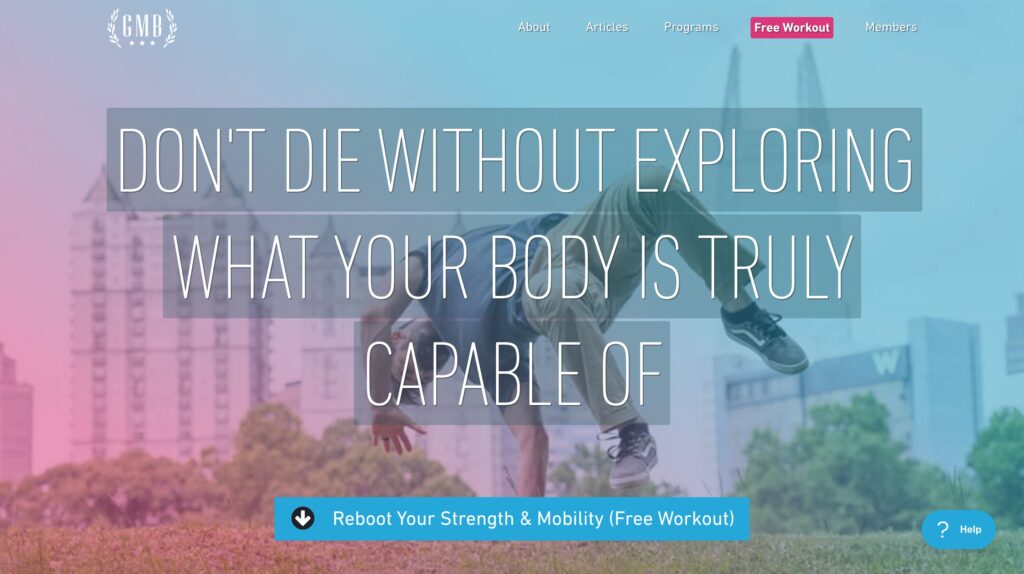
They emphasize their unique approach to fitness, focusing on movement skills and functional strength, which resonates with their target audience.
2. Write Persuasive Copy that Converts
You've kickstarted your landing page with a standout value proposition – keep that momentum going!
Guide your visitors through a clear narrative that highlights the benefits of your course, culminating in a distinct call to action (CTA). Make it irresistible for them to take the next step.
AIDA and PAS are *two* popular frameworks for crafting compelling copy for landing pages. Both offer structured approaches to guiding potential students through the decision-making process.
Let’s dive deeper into each framework and see how they can enhance your landing page.
What is the AIDA Framework?
The AIDA framework helps structure persuasive messages in a way that catches attention, holds interest, builds desire, and drives action.
Attention: Grab attention with a strong headline or opening line.
- Use a bold statement, a question, or a surprising fact.
- Keep it clear and concise, making sure it resonates with your audience.
Interest: Build interest by providing relevant information.
- Highlight the key benefits of your course.
- Use bullet points or short paragraphs for easy reading.
Desire: Stir up a desire for your course.
- Showcase testimonials, success stories, or unique selling points.
- Make the benefits feel personal and valuable to the reader.
Action: Prompt the reader to take action.
- Use clear, compelling CTA buttons or links.
- Create a sense of urgency or scarcity to encourage immediate action.
The AIDA framework has several strengths that make it highly effective across various applications.
It is excellent for highlighting the benefits and outcomes of a product or service, providing a clear and easy-to-follow structure that guides the reader through a logical journey.
Additionally, its versatility allows it to be widely applicable across different industries and types of content, making it a valuable tool for marketers and content creators alike.
When using the AIDA framework, there are a few things to watch out for.
It may seem formulaic if not applied creatively, which can diminish the impact of the content. Furthermore, it can become redundant if overused or applied incorrectly, leading to a repetitive and less engaging experience for the reader.
What is the PAS Framework?
The PAS framework is great for tackling specific issues that your target audience might be facing. It focuses on identifying a problem, agitating that problem, and then presenting a solution.
Problem: Identify a problem that your potential students face.
- Understand their pain points and challenges.
- Use empathetic language to show you understand their needs.
Agitation: Agitate that problem to make it feel more urgent or impactful.
- Use emotional language to emphasize the consequences of not solving the problem.
- Make the problem feel immediate and significant.
Solution: Offer your course as the perfect solution.
- Clearly explain how your course solves the problem.
- Highlight the unique features or benefits of your course.
The PAS framework excels in problem-oriented marketing by directly addressing customer pain points and effectively highlighting the benefits of a solution.
This approach makes it particularly valuable for crafting messages that resonate deeply with the audience, providing clear reasons why a product or service is necessary and beneficial.
However, when using the PAS framework, it's important to balance the content to avoid overly negative tones, which can alienate the audience if not handled correctly.
Additionally, this framework may not resonate as effectively with audiences that do not prioritize problem-solving, as its focus is primarily on addressing and resolving specific issues.
Both frameworks provide a simple and effective way to guide potential students toward enrollment. Use these strategies to create engaging and persuasive copy for your landing page.
Let's look at GMB Fitness again for a masterclass on how to leverage persuasive copy to draw their target market in.
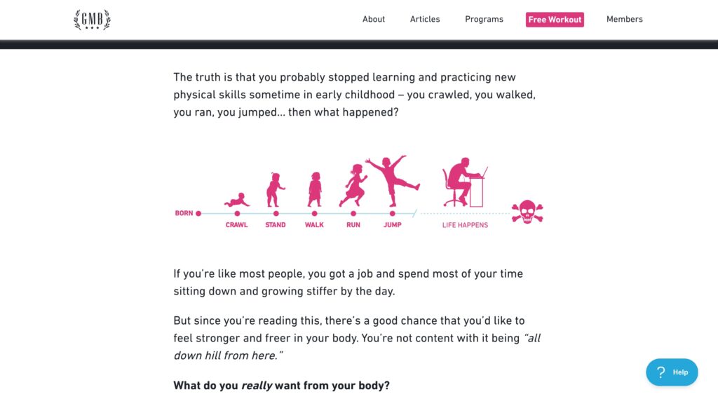
Their copy follows the PAS (Problem, Agitation, Solution) framework effectively. They identify the problem many people face with traditional fitness routines, emphasize the frustration and lack of results, and then present their program as the perfect solution.
3. Optimize with Design and Layout
Good design isn't just about looking pretty. It's about guiding potential students toward taking action. Key elements include:
- Clear headlines,
- Engaging images, and
- Prominent call-to-action buttons
Keep things simple and focused, so it's easy for visitors to understand what you're offering and what they should do next.
User Experience Best Practices Checklist
A great landing page should be easy to navigate and accessible to everyone.
Make sure the layout flows logically, leading visitors from the headline to the benefits and finally to the call-to-action.
When creating your landing page, there are a few key factors to keep in mind:
- Readability:
- Use a legible font.
- Choose a color scheme that provides good contrast.
- Simplicity:
- Keep the page simple and uncluttered.
- Avoid using too many images, colors, or fonts.
- Make sure the page is easy to navigate.
- Visual Appeal:
- Use high-quality images and graphics relevant to your course.
- Include images of students or professionals in your field to help visitors picture themselves in your course.
- Navigation:
- Ensure your landing page is easy to navigate.
- Include clear calls to action and a simple enrollment process.
- Mobile Responsiveness:
- Make sure your landing page works well on mobile devices.
- Many visitors will access your page from their smartphones or tablets.
Streamline Navigation and Sign-Up Processes by…
- Using CTAs Effectively: Clear and prominent calls to action (CTAs) are vital. Make sure your CTAs are easy to find and use action-oriented language like “Enroll Now” or “Start Learning.”
- Including a Signup Form Right on Your Landing Page: Having a signup form directly on your landing page can significantly increase conversions. Keep the form short and straightforward to minimize friction during the signup process.
Here are some examples to inspire you:
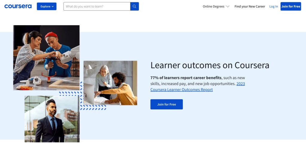
Coursera: Their landing pages feature clear headlines, relevant images, and straightforward CTAs like “Join for Free.” The layout is simple and focused, guiding visitors toward signing up.
Skillshare: Skillshare uses clean design, with ample whitespace, simple navigation, and a clear value proposition. Their landing page includes an easy-to-use signup form that invites visitors to start a free trial.

4. Customize with Content Personalization
Make your course landing page more engaging, with content personalization.
MemberMouse is a WordPress LMS Plugin with a smart trick up its sleeve: SmartTags™.
They allow you to customize what users see based on their preferences and behavior. It's a clever way to tailor content for different audiences, enhancing the overall experience and increasing conversions.
Customizing User Experience with SmartTag™ Technology
SmartTags™ offer several ways to personalize your landing page for visitors and members.
Custom Decision SmartTag™
- This tag lets you display different content based on where visitors clicked through from, like a specific Google or Facebook ad. Aligning your landing page content with the marketing message that brought them to your site creates a consistent and relevant user experience.
Member Decision SmartTag™
- This tag helps you show different content to existing members who have already purchased one of your products. It’s ideal for upselling or cross-selling because you can present targeted offers or information based on what they've bought before.
Member Decision Custom Field SmartTag™
- With this tag, you can display different messages based on information provided during sign-up. For example, if members define their interests using a dropdown menu at sign-up, you can show specific content to those interested in weightlifting and different content to those interested in Pilates.
5. Build Trust with Social Proof
The Power of Testimonials on Your Landing Page
Adding social proof, like testimonials, to your landing page is a fantastic way to build trust with your audience.
Social proof is the idea that people are more likely to act if they see others doing it. Testimonials offer a glimpse into the experiences of past students or customers, helping to establish credibility.
Choosing the Right Testimonials
When selecting testimonials for your landing page, focus on those that are relevant to your course.
For instance, if you're offering a course on social media marketing, you might highlight feedback from business owners who increased their social media following after taking your course. This makes your course relatable and highlights its effectiveness.
Displaying Testimonials Effectively
It's important to make your testimonials easy to see on your landing page. A great approach is to include a short quote from each testimonial along with a photo of the person who provided it.
This not only builds trust but also makes the testimonials more engaging and memorable for your audience.
GMB Fitness, yet again, also excels in using social proof.
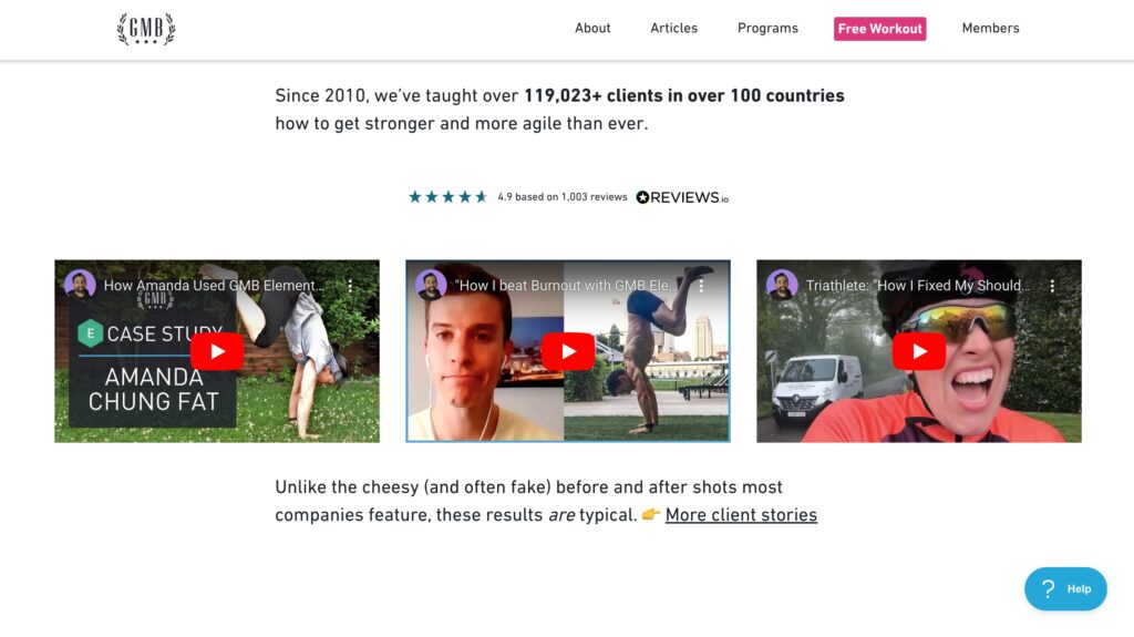
They feature well-produced video testimonials from satisfied clients, which builds trust and reinforces the effectiveness of their program. These testimonials add credibility and help potential students feel confident about enrolling.
6. Use FOMO to Spur Action
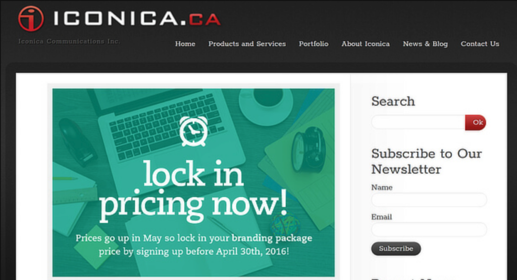
Creating a sense of scarcity or urgency is an effective way to encourage potential students to enroll in your course. People don't want to miss out on a great opportunity, so adding a time limit or limiting the number of spots available can motivate them to take action.
For example, you might offer a discount that expires soon or limit the number of seats in your course. You could also highlight how many people have already enrolled, showing that the course is filling up fast. These tactics can help nudge people towards making a decision.
Creating Offers That Can't Be Refused
To make your course irresistible, you can bundle it with extra value or offer a special deal. This could include things like bonus materials, one-on-one coaching, or an exclusive community membership.
The key is to make the offer so good that potential students feel they can't afford to miss out.
For example, you could offer a limited-time discount or include valuable bonuses like downloadable resources or extra course modules. These offers can add a lot of perceived value, making your course more appealing and increasing the chances of enrollment.
Take a look at this example from Iconica:
Conclusion
Let's quickly recap the key points we've covered to enhance your online course's landing page:
- Craft a Strong Value Proposition: Clearly define what sets your course apart.
- Write Persuasive Copy: Use frameworks like AIDA & PAS to engage and convert visitors.
- Optimize Your Design and Layout: Ensure your page is visually appealing and user-friendly.
- Personalize Content: Use tools like MemberMouse SmartTags™ to tailor the visitor experience.
- Build Trust with Social Proof: Feature customer testimonials to establish credibility.
- Employ FOMO Tactics: Introduce elements of scarcity and urgency to spur action.
If your current landing page isn't giving you the enrollment numbers you expect, now's the time to make some changes. Use the strategies we've discussed to revamp your page and truly connect with your audience.
Remember, a great landing page isn't just about looking good – it's about resonating with potential students and getting them to take that next step.
Next Steps
Ready to transform your landing page into a conversion powerhouse? Start experimenting with the layout, tweak your copy, and refine your value proposition.
Don't be afraid to test different approaches to see what resonates best with your audience. Iterate based on feedback and analytics, and you're sure to see improved results. Let's get your course the attention it deserves – update your landing page today and watch enrollments start rolling in!
Can you think of any examples of great landing pages for courses that are optimized for conversions? Got any tips to share with the MemberMouse community? Let us know in the comments section below.
If you enjoyed this post, come follow us on Facebook, Twitter, Pinterest, and LinkedIn!
 Blog
Blog Podcast
 Support
 Customer Login
